Vanochtend had ik Talking to Strangers uit, van Malcolm Gladwell. In een mooie audio productie, met fragmenten van interviews er tussendoor, een beetje vormgegeven als een podcast. Ik wilde er een review over schrijven maar was nog een beetje aan het piekeren.. waar ging dit boek nou echt over? Misverstanden? Bedrog?
Vanmiddag ging ik nog even een paar boodschapjes halen. Ik zag een mooi plekje, naast een kleine auto waar nog een vrouwtje achter stond. Ik moest er omheen draaien, en stond daardoor wat scheef in het vak, met de voorkant dicht bij een boom. Ik wachtte in mijn spiegel tot de mevrouw weg zou lopen, zodat ik beter kon parkeren, licht mopperend (‘mevrouw, wat doet u daar, kunt u even opzij gaan!’) in mijn hoofd, maar ze bleef staan. Ik liet het maar zo, en stapte uit. “U staat helemaal op de weg!” riep ze. Mijn eerst reflex was om haar boos te zeggen dat ze in de weg stond bij het parkeren, maar ik dacht aan ‘Talking to strangers’ en schakelde meteen om. “Ja dat is wel zo, maar ik kon niet goed parkeren wegens die boom”. Ze vertelde dat haar auto op die parkeerplaats een keer was aangereden, niemand had wat gezien, en daarom wilde ze me waarschuwen. “U staat helemaal op de weg, er rijd zo iemand tegenaan”. Ik gaf haar helemaal gelijk en zei dat ik mijn auto beter ging zetten. “Zal ik even kijken bij die boom voor u, zodat u daar niet tegenaan gaat?” Nee hoor dat hoefde niet van mij, ik bedankte haar hartelijk voor het meedenken en ik zette de auto een stukje naar voren.
Dit is waar Talking to Strangers over gaat. De manier waarop vreemden een gesprek in gaan is vanuit een heel subjectieve waarheid, en de aanname is dat de andere partij voldoet aan je beeld. Een politieagent die iemand aanhoudt heeft een waarheid, een student op een feestje heeft een waarheid, een spion heeft een waarheid, politici hebben waarheden. En vaak doen mensen niet echt hun best om te zien of die waarheid klopt. Die agent denkt dat de bestuurder criminele bedoelingen heeft, de student denkt dat het meisje ondanks de drank nog echt wel kan oordelen of ze iets wil met hem, de politicus gelooft in de goede intenties van die vriendelijke en charmante meneer Hitler. Vaak geloven mensen zo in hun eigen beeld dat ze de aanwijzingen dat dat beeld niet klopt volkomen missen.
In ieder geval was die mevrouw op het parkeerterrein dus geen bemoeizuchtig iemand die me de les wilde lezen over mijn parkeertalent, maar gewoon een heel aardig iemand die een ander mens zomaar wil behoeden voor narigheid. Dus rustig uit gaan van de feiten, proberen te begrijpen wat de context van de ander is, niet in je reflex schieten, dat kan al enorm helpen als je met vreemden praat.
Het is een leuk en interessant boek om te lezen/luisteren, typisch Gladwell, met mooie anecdotes, verhalen die je nog niet kent, en onderzoeksresultaten die zijn verhaal onderbouwen. Alleen die titel.. het is dus duidelijk geen zelfhulpboek over converseren en die indruk maakte het lang wel op mij, door de associatie met ‘How to win friends & influence people’ en ‘How to talk to anyone’. 4 van de 5 sterren.
Twee uitstekende en nuchtere verhalen over hoe AI in gezondheidszorg wordt toegepast. De nederlander Michael Abramoff, werkzaam in Iowa, vertelde over geautomatiseerde diagnose van oogziekten, en Elisabeth Asai over datzelfde bij huidziekten. De computer helpt daarbij de mens door een snelle en nauwkeurige diagnose. Het doel hiervan is betere toegang tot de zorg, en lagere kosten.
Opvallend bij beide verhalen was dat ze al decennia mee bezig zijn met automatisering bij diagnose. AI is geen revolutie maar een evolutie. In de jaren 80 met regel-gebaseerde systemen waarbij de computer vragen stelde. Daarna met eenvoudige convolutionele netwerken maar dat werkte nog niet goed: Ze konden alleen maar werken op kleine foto’s (16×16 pixels) en waren daardoor erg onnauwkeurig, en ze waren breekbaar: Door kleine verstoringen werkte het al niet meer. Moderne AI heeft betere algoritmes, er is meer computerkracht, en kan worden gewerkt met goede scherpe foto’s.
De oogdiagnosetool van Abramoff is bijzonder, want FDA goedgekeurd. Dat vereiste een groot proces, waarbij de kenmerken van het algoritme moesten worden ‘gematcht’ met de eisen van FDA Trials:
Gevoeligheid: Hoeveel gevallen vangt je systeem
Specificiteit: Hoe weinig vals positieven vangt je systeem
Diagnosabiliteit: Het moet werken op de overgrote meerderheid van alle gevallen
Daarnaast zijn er bij de FDA veel eisen over de manier van werken, en is het AI systeem verantwoordelijk voor de diagnose. Toen een vraag uit het publiek kwam wat Abramoff vond van de resultaten van Google, die met deep learning allerlei kenmerken (zoals geslacht) uit oogfoto’s kon halen, zei hij simpelweg: Zij zijn niet FDA goedgekeurd, en meer kan ik daar niet over zeggen. Met andere woorden: Daar hangt al dat gewicht niet aan.
Beiden legden ook goed uit hoe hun algoritmes in elkaar zaten, met deep learning worden biomarkers herkend en anomalieen gevonden. De nauwkeurigheid is niet altijd goed te vergelijken met de diagnose van mensen, omdat daar heel veel ‘ruis’ in zit. Zelfs artsen uit verschillende landen scoren totaal anders met hun diagnosenauwkeurigheid. Er wordt daarom alleen gekeken naar de uitkomst. En er is geen praatje over AI waar niet over bias gesproken. Voor de huidziekte diagnose is dat nu nog lastig voor donkere huid.
En beiden maakten het heel duidelijk waar AI momenteel goed werkt: Op een klein, heel goed gedefinieerd onderdeel kan AI heel behulpzaam zijn met snelle, goedkope, schaalbare en goede diagnose. Het beeld van de robot dokter die binnen een paar jaar alle medische banen overneemt is volslagen onzinnig.
Een duo presentatie van 2 docenten die bij de CIA ‘Creatief Denken’ onderwijzen. Creatief denken en verbeelding werd bij de CIA een echt onderwerp na het 9-11 rapport, dat onder andere concludeerde: “It is therefore crucial to find a way of routinizing, even bureaucratizing, the exercise of imagination.”. Maar hoe doe je dat?
Het allerbelangrijkste is om vooral zo lang mogelijk ‘divergent’ te blijven denken en meer wegen te zoeken, voor je te verbinden aan 1 oplossing. ‘Resist the urge to converge!’
De CIA instructeurs gebruiken een systeem met 4 elementen, allen vernoemd naar dieren om makkelijk te kunnen onthouden:
Wombat – Herkaderen
Het kader van het probleem kan je uitbreiden met de term ‘Wombat’: What might be all the …. Je wordt uitgedaagd om van jrobleem (‘Hoe kom ik over de rivier’) te her-kaderen: Wat zijn alle manieren waarop ik over de rivier kan komen. Dit scheelt echt, je komt tot veel meer opties. Dus stel vragen die uitnodigen tot nadenken, wat ze noemen ‘invitational questions’, met meervoud. Dus niet: ‘Hoe’ maar ‘Op welke manieren’.
Wolf – Out of your box
De wolf staat voor ‘out of the box’ denken. Met wie zouden we kunnen samenwerken om dit probleem op te lossen. In het geval van het MH-17 onderzoek waren dat bijvoorbeeld tal van instanties die met veiligheid, luchtvaart, geografische data en raket wetenschap te maken hadden. Ook werkt CIA samen met heel andere organisaties, zoals Hollywood schrijvers om een verhaal over te brengen, science fiction schrijvers, zelfs goochelaars. Vraag je dus af: “Op welke manieren kan ik leren van iemand met een ander beroep?”. Lees andere tijdschriften. Neem andere routes.
Wood Duck – Denk in analogieën
Het viel een CIA medewerker eens op dat de Wood duck (Carolina-eend in het nederlands) een heel ander leven had dan andere eenden. Hij verbleef in bomen, en was vaak samen met eekhoorns. Hij migreerde hel anders. Dat kan je gebruiken om je verbeelding te voeden. Op welke manier kan de verdachte heel andere patronen hebben dan de rest? Maak daar een verhaal van, alsof het een film is. Bij de CIA maken ze zelfs echte filmposters en maken complete fantasie-verhalen. Dit helpt creatief denken én het overbrengen daarvan. Om je op gang te helpen kan je kijken naar jouw antwoorden op vragen als: Wat doe ik graag in het weekend, of Wat is mijn favoriete kunstwerk. Ga dan na hoe je het probleem kan zien in dat kader. Een van de agenten koos bijvoorbeeld een kunstwerk met watervallen en rivieren, en ziet anti-terrorisme nu in dat kader: Als we een blokkade maken, stroomt de rivier daar om heen. En bij anti terrorisme is dat net zo.
Otter – Breek patronen
De vorige oplossingen werken misschien niet meer. Bij CIA hebben ze daarvoor een ‘Red Cell’: Een groep mensen die zoekt naar ‘Black Swans’ (verrassende gebeurtenis met grote gevolgen), ‘Gray Rhinos’ (verwachte problemen die nog steeds verrassen), ‘Dogs that don’t bark’ (gebieden die tot niets leiden) en ‘Plate tectonics’ (dramatische veranderingen die zeer langzaam plaatsvinden). Een van de voorbeelden hiervan is bekend geworden in het boek en de film Argo, waarbij Amerikanen werden bevrijd uit Iran door het land te bezoeken met een team dat zogenaamd een film aan het maken was. Zo’n crew bestaat uit mensen uit de hele wereld, en alleen hollywood mafkezen gaan een bezet land in om te filmen. Dus geloofwaardig, en makkelijk om aan mee te werken. Doe dus juist niet wat je normaal wel doet.
This spring I took a wine course, comparable to level WSET-3, together with my girlfriend. To bring the theory into practice, we spent the past 2 weeks on holiday in France to visit two major wine areas: Burgundy and the south of the Rhone valley. A wine-themed vacation. Here are some of our tips and tricks, do’s and don’ts.
Burgundy
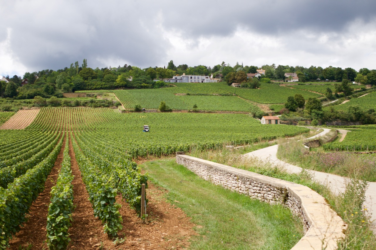
Week 1 was in the town of Beaune, right in the middle in the Cote d’Or. Beaune is an ideal home base to explore the region. Even by foot: If you walk out of the village towards the west, you’ll be between the grapes right away. Burgundy = wine, that’s very clear. And Burgundy is pinot noir and chardonnay, two grape varieties you’ll get to know intimately if you stay here for a week.
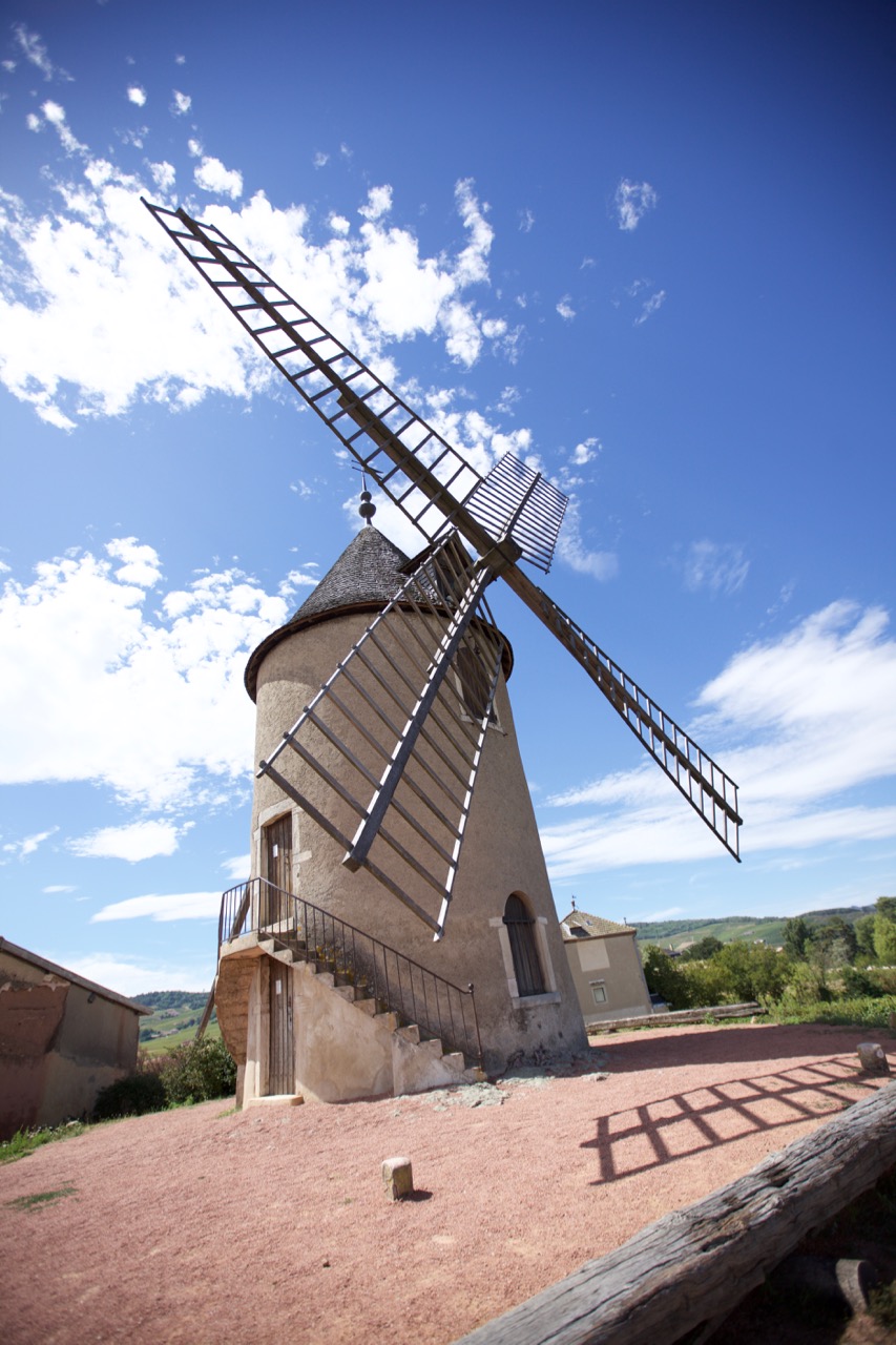
Walk just outside of Beaune and you’ll see this.
It’s a great idea to rent a bike. We did that for a day and rode south. Unless you take all day, or are really fit (there are no flat meters, although it rarely gets very steep) you’ll get not much further than Meursault, via Pommard and Volnay. But you’ll see a lot! By car, we took the péage to the most northern town of the Cote d’Or, Fixin, and drove back south towards Beaune through all those famous towns whose names we crammed for so long. Moray-Saint-Denis, Chambolle-Musigny, Vougeot, Vosne-Romanée, Nuits-St-Georges.. It’s great to see these names as town names, just 5 minutes apart by car, rather than as a dry list in a wine theory book.
In Burgundy, there are plenty of options to taste wine, indicated by ‘degustation’ signs everywhere. You wil generally pay for tasting. If you then purchase, tasting will not be charged in most cases. In my mind, that is not unreasonable, since the area is so popular and the wines are expensive.
Did I already mention that Burgundy wines are expensive? We needed some time to adjust, before we splurged on our first €30+ bottles. Of course the quality is similarly very high. And in tasting, it always turns out the best wines are the most expensive. Even if you’ll only hear the price after tasting them. “I liked that one best.. oh is that €69.. ok..”. We’re not ready for that yet.
Use the spittoon. Many tourists don’t, but believe me that you will be able to taste a lot better if you spit it out. Especially if you have 2-3 tasting sessions per day of 5 wines each. It also makes you come across as more serious, and you may get some extras, or a taste from a special barrel, like we once experienced.
Our top tips when it comes to tasting:
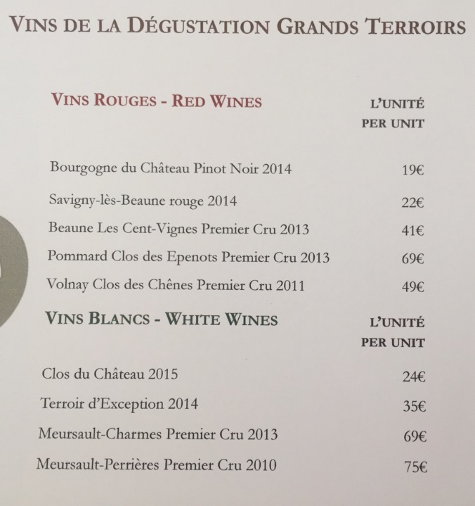
Chateau Meursault. Beautiful place, very good extensive guided tour, not just about them but informative about the Burgundy area and traditions. It costs €29 each for the ‘9 wines’ tasting option, with really excellent wines. And if tasting is €29, you can imagine what the bottles cost…
Chateau de Meursault tasting list. Yikes. This was our most expensive outing, having purchased some bottles of the Terroir d’Exception and the Volnay.
Olivier Leflaive in Puligny-Montrachet. They have a wonderful shaded courtyard, and you’ll be able to just sit and relax and taste some lovely wines. It is also a hotel, with signs saying ‘We can arrange shipping to USA and Hong Kong’. Use to your advantage.
A less satisfying experience was with Drouhin in Beaune. Although the extensive cellar maze with old wine presses is very impressive, it scores a bit low on the price-quality compared to others. Still interesting to see the connection between the Drouhin family and the town of Beaune.
Our day trip to the Beaujolais region was a bit disappointing as well. Maybe we just weren’t lucky, but the two tastings we did there were ok, but not great. Wines are made from the gamay grape in that region, which makes them very different from the rest of Burgundy. In fact, you don’t hear any mention of Beaujolais on any tour or talk in Burgundy, while the Chablis area (much further away) is mentioned frequently. Beaujolais seems not to be considered part of Burgundy, by the rest of Burgundy. We still took several nice wines, they are of course tasty and especially good value for money. And the scenery is beautiful!
The well-known ‘Moulin a Vent’
Don’t forget to try and bring some Cremant-De-Bourgogne. Made just like champagne, but at a friendlier price. A nice change to have as aperitif, or even with a meal.
Eating out tips for Beaune:
La Petite Taverne (Facebook link): what a nice restaurant. It is inside an antiques shop, has only 5 tables, and is run by one man who takes care of the guests and prepares the food in the kitchen. So sometimes you’ll see people arrive in the restaurant and there’s no host, because he’s cooking. Entertaining. We had a very tasty wine-fondue (slowly cook pieces of beef in reduced wine). When you leave, all other guests greet you and you’ll get a warm goodbye from the owner. Make sure you get there around 7pm, or make reservations. You can do this via Facebook Messenger, even in english, although response may be hours later. Highly recommended experience in Beaune.
Also recommended is Les Poppiettes. The owner is italian, there’s a level of chaos in there that is just exactly right, the food is great and the service is very friendly.
Our favorite wine bar is La Dilettante, a few minutes outside of the center of town. Good choices in wine, and you can get a nice platter of charcuterie or cheeses with it.
As a break from the wine theme, taking a tour of the local mustard factory is recommended. A family-run factory, employing about 18 people. Don’t go there if you have very sensitive eyes, because the mustard fumes in the factory will eventually bring the toughest man to tears.
Chateauneuf-du-Pape
After our week in Burgundy, still reeling from the sticker shock of the expensive wines, we got in our electric car and drove south towards Chateauneuf-du-Pape, central in the southern Rhone valley, about a 4-5 hour drive. We stayed in a very nice Bed and Breakfast which as a certified sommelier as its owner/host. She is very active in the wine industry there, and she knows more places and reputations of wines than you will ever discover by yourself. Highly recommended. Danielle gave us many tips, addresses and even made reservations for a few tours and tastings for us. Around Chateauneuf there are the famous towns of Gigondas, Vacqueyras, Lirac, Tavel, Beaumes-de-Venise.. you name it. We did quite some touring!
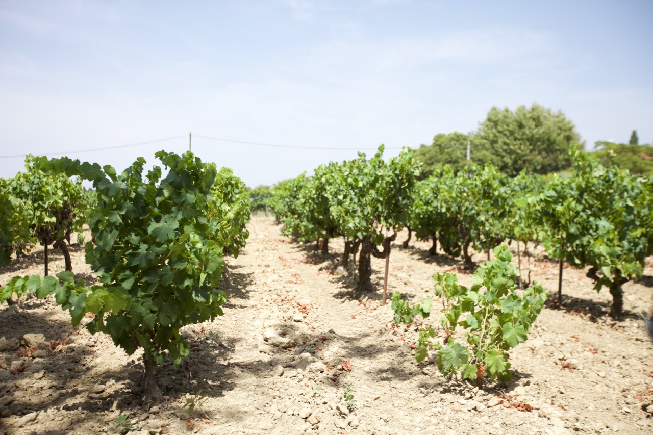
Not all grapevines are planted between pebbles, a cliché image that you will see everywhere. There are many types of soil and they have big impact on the produced wine. .
As far as eating out in Chateauneuf itself there are not so many options. There is the Le Verger du Pape, near the castle ruins, which is great. The view across the Rhone valley is beautiful and the food and wines are very good. Make sure you make reservations there. We did this for the next day when we walked by one evening, on our way to see the castle ruins (and the interesting wine expo behind it: All 13 permitted varieties of grapes are planted there on one plot). Other nice restaurants are Le Pistou (we went there twice), and La Maisounnette is reputed to also be good but we weren’t able to go there ourselves.
Tasting is a joy. It is generally free, and the wines are also much more affordable. Very different in character from Burgundy of course, but very good as well. Make sure you also taste plenty of white wines (up and coming in Chateauneuf du Pape), they can be very good. A couple of our favourite addresses:
Domaine de Banneret, in the town of Chateauneuf, was a great experience. The wife of the owner did a very enthousiastic free tour, in English. There was no pressure at all to purchase, she just loved to tell us the story of their vineyards. Of course we did end up buying some of their bottles… very good smooth full bodied spicy red wine. Only on appointment.
Domaine Galévan, just outside of Chateauneuf. We had to go here on strong recommendation of our B&B host, who had served us some of their white wine earlier. A very refined fruity taste, with some minerality at the end. The lady winemaker was not there (she was on vacation) but her father helped us out. We bought white, rosé wine and two types of red. Excellent and very affordable, at around €10 per bottle.
Free shipping to your car at domaine Galévan
Domaine du Gour de Chaulé in Gigondas. Run by a female winemaker as well, like Galévan. A very nice lady, very open and friendly, clear explanation of their way of making wine, good tour, extensive tasting.
Domaine la Baroche, in Chateauneuf. A hyper modern way of making wine, which makes it interesting to visit. Concrete vats, sensors everywhere, and very tasty wines. As is common in this area, there is no pressure to buy at all.
We also visited the town of Laudun. This is one of the towns in the Cote du Rhone that is in the ‘Village’ appellation but is allowed to put the name of their town on the label. This means higher quality. We visited the Domaine Pelaquie, and tasted and bought some very affordable quality wine. Recommended.
The town of Beaumes-de-Venise is worth a visit too. We tried some very nice sweet dessert-wines at the cooperative. They make a nice gift too. A trip to the other side of the Rhone to visit Lirac and Tavel (famous for their rosé wines) was mixed. We didn’t find Lirac very inspiring, but we had a very nice tasting at Caveau Saint Vincent (Google maps link). They carry rosé of all local Tavel producers, so it’s very nice and interesting to taste them side by side. Friendly proprietor. Please be aware that they close during lunch time.
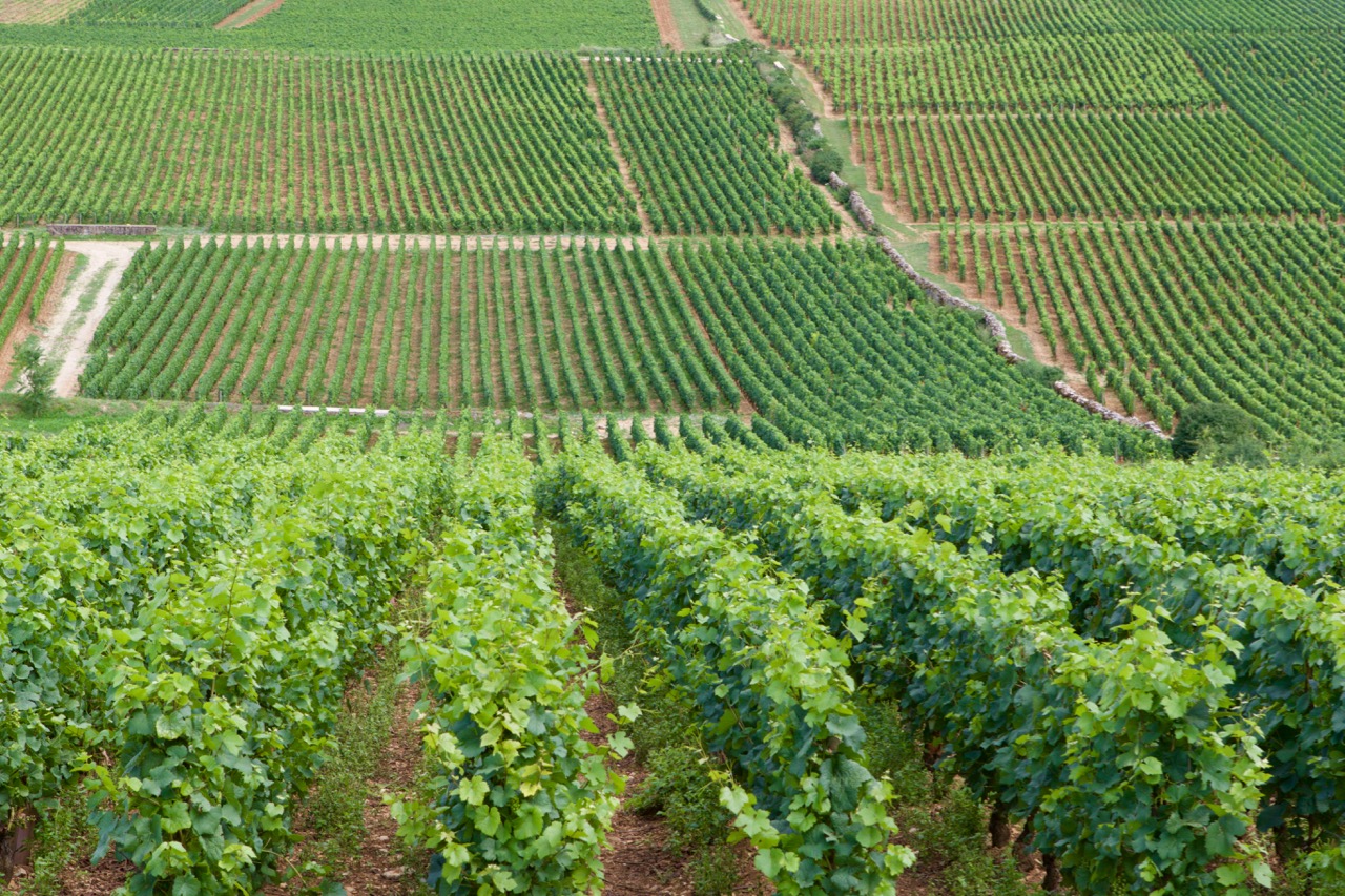
In general, one can say that in Burgundy, everything is about wine. In the Rhone area this focus is less strong. Burgundy has quite an ‘agricultural’ feel about it, especially the northern part of the Cote d’Or (the Cote des Nuits), with tractors on the roads. As a wine lover it is fantastic to actually see all the differences between the areas and the plots. A slightly different orientation towards the sun can make a big difference in the class of wine produced.
That is in fact the story of the ‘Terroir d’Exception’ wine we purchased at Meursault. Inside a premier cru area, a part of a plot has a disadvantageous orientation towards the sun because it is in a slight dip of the land. Hence, wine coming from that part of the plot isn’t premier cru, and has very different pricing because of that. And we loved it! But those are the details one needs to know; and knowing that each plot is shared between several wine makes, makes things very complex indeed. You can learn about Burgundy your entire life.
The Rhone area is very different. Villages each have their own character, their own face, their own terroir. They all use a selection of the 13 allowed grape varieties, and each village uses their own traditions to produce wine from them. Making each town unique. Vacueyras even has ‘Hollywood sign’ lettering of their town name on the hill. This illustrates the character I think; each town is their own brand, while Burgundy really feels like one contiguous area. And both have their unique charm.
On our way back we spent a night at the ancient town of Troyes. So, champagne as a dessert. Troyes is a very nice town, well worth a visit.
We are already thinking about our next wine vacation. Loire and Bordeaux, or maybe take a different route and visit the Alsace and Mosel/Rheingau area first?
Dit voorjaar heb ik samen met mijn vriendin een SDEN-3 niveau wijncursus afgerond. Om al die theorie eens in de praktijk te toetsen zijn we de afgelopen 2 weken naar 2 belangrijke wijngebieden in Frankrijk geweest: De Bourgogne en het zuidelijke Rhone gebied. Vakantie met wijnthema dus. Onze ervaringen, tips & trucs, do’s and don’ts.
Bourgogne
Week 1 was in Beaune. Een ideale uitgangspositie voor de Bourgogne. Als je in westelijke richting uit het stadje wandelt sta je meteen tussen de druiven. Bourgogne = wijn, dat is duidelijk. En Bourgogne is pinot noir en chardonnay. Die leer je in een week echt goed kennen.
Loop Beaune even uit en je ziet dit.
Het is leuk om een fiets te huren. Wij hebben dat een dag gedaan en naar het zuiden gereden. Tenzij je echt een hele dag neemt of vrij stevig doorfietst (er is daar geen meter echt vlak) kan je niet veel verder komen dan Meursault, via Pommard en Volnay. Maar dan zie je dus meteen al heel veel! Met de auto zijn we naar het noordelijkste stukje van de Cote d’Or gereden, Fixin, en daarvandaan via alle bekende stadjes terug naar Beaune. Een feest der herkenning. Moray-Saint-Denis, Chambolle-Musigny, Vougeot, Vosne-Romanée, Nuits-St-Georges.. Alle rijtjes die we hebben gestampt werden nu ineens plaatsnaambordjes, vlak bij elkaar.
In Bourgogne kan je op veel plaatsen terecht om te proeven, de borden ‘Degustation’ zijn alomtegenwoordig. Reken er wel op dat je betaalt voor het proeven, tenzij je daarna koopt, dan wordt het proeven vaak gratis. Niet onredelijk voor zo’n populair gebied met dure wijnen.
Had ik al gezegd dat Bourgogne wijnen duur zijn? We hebben nogal moeten wennen voor we onze eerste flesjes van €30+ kochten. Uiteraard is de kwaliteit wel navenant, steeds blijkt bij het proeven ook dat de duurste echt de beste zijn. Ook voordat ze de prijs vertellen.. ‘Die is het lekkerst.. oh is die €69.. ok..’
Gebruik de spuugbak. Veel toeristen doen dit niet, maar geloof me dat je echt beter proeft als je netjes uitspuugt. Zeker als je 2x 5 wijnen proeft op een dag. En dat gaat voorkomen. Bovendien kom je dan serieuzer over en dan krijg je soms wat extra’s, en wordt er uit een ander vaatje getapt voor je.
Onze beste ervaring wat betreft proeven:
Chateau Meursault. Prachtige plek, heel goede fijne rondleiding, €29 pp waarbij je 9 uitstekende wijnen proeft. Als proeven al 29 kost kan je raden wat de flesjes per stuk zijn..
Chateau de Meursault proeflijst. Yikes. Ons duurste uitje, de Terroir d’Exception en de Volnay gekocht.
Olivier Leflaive in Puligny-Montrachet. Op de binnenplaats, heerlijk zitten en rustig proeven. Is ook een (prijzig) hotel, ‘We can arrange shipping to USA and Hong Kong’, dan weet je het wel.
Onze minste ervaring: Drouhin in Beaune. Hoewel het een mooie rondleiding is door een indrukwekkend kelderstelsel is het qua prijs-prestatie niet erg gunstig.
Ook niet top was onze dagtocht naar de Beaujolais. Misschien hebben we het niet getroffen, maar beide proeverijen daar waren ok, niet super. De wijnen zijn heel anders daar, en je hoort in de rest van Bourgogne ook nooit iets over Beaujolais. Wel over Chablis, dat ook bij de Bourgogne hoort hoewel dat veel verder weg ligt. Beaujolais is toch een beetje tweederangs, vanuit de Bourgogne gezien. Evengoed wel wat wijntjes meegenomen.. ze zijn natuurlijk nog altijd erg goed. Gamay is alleen niet hetzelfde als pinot. Wel is de omgeving natuurlijk erg mooi.
De bekende ‘Moulin a Vent’
Neem ook wat Cremant-de-Bourgogne mee. Net als champagne, maar dan vriendelijker geprijsd. Weer eens wat anders als aperitief of zelfs maaltijdwijn.
Eettips in Beaune:
La Petite Taverne (Facebook link), wat een leuk restaurant. In een antiekzaak, 5 tafeltjes, de man in de bediening is ook de chef dus soms komen mensen aan en dan is er niemand om ze op te vangen want dan is meneer in de keuken bezig. Geestig. Bij vertrek groeten de gasten elkaar, en krijgen een uitgebreid afscheid van de eigenaar. Heerlijke wijnfondue gehad, echt een aanrader. Het is piepklein dus zorg dat je in de buurt van 19:00 komt opdagen, of reserveer. Dit kan via Facebook Messenger, in het Engels geen probleem, met enige vertraging.
Ook lekker is Les Poppiettes. Italiaanse eigenaresse, heerlijk niveau chaos, aardige bediening, erg lekker eten.
Een leuke wijnbar is La Dilettante, een paar minuten buiten het centrum. Veel keus, lekker bordje met charcuterie of kaas er bij, top.
Een andere tip is om naar de mosterdfabriek te gaan in Beaune. Daar doen ze leuke rondleidingen. Niet doen als je erg gevoelige ogen hebt, want een uur in zo’n fabriek kan door de hangende dampen zelfs de stoerste man aan het huilen brengen. Om te janken zo mooi.
Chateauneuf-du-Pape
Na ons weekje Bourgogne, nog bijkomend van de sticker-shock van de dure wijnen, stapten we weer in het elektrische autootje en naar het zuiden. We verbleven in in een heel fijne Bed and Breakfast met als gastvrouw/eigenaresse een sommelier. Ze is zeer actief in de wijnwereld aldaar, en kent meer adresjes en de reputatie en kwaliteit van de wijnen dan je ooit zelf zal ontdekken. Zeer aan te raden. Danielle gaf ons tips, adressen en regelde zelfs afspraken voor rondleidingen en proeverijen. Rondom Chateauneuf liggen veel bekende wijnstadjes als Gigondas, Vacqueyras, Lirac, Tavel, Beaumes-de-Venise.. noem maar op. We hebben flink rondgetoerd.
De wijnstokken staan niet allemaal op keien, het cliché beeld van zuid-Rhone. Er zijn veel meer soorten ondergrond, en veel meer variaties.
Wat betreft eten in Chateauneuf-du-Pape zelf is er niet zo veel keus. Le Verger de Pape, vlak bij het kasteel, is aan te raden. Geweldig uitzicht en heerlijk eten. Wel reserveren, een dag van te voren langslopen werkt uitstekend. Dan kan je meteen even de druiven-expo achter het kasteel bekijken; daar staan alle 13 in de regio toegestane druivenrassen aangeplant. Verder is Le Pistou prima. La Maisounnette is waarschijnlijk ook goed maar konden wij niet proberen.
Proeven is een feest. De wijnen zijn vanzelf al veel betaalbaarder dan in Bourgogne, van een totaal ander karakter, maar ook erg goed. Verrassend zijn de witte (in opkomst in Chateauneuf-du-Pape). Een paar adresjes:
Domaine de Banneret. In Chateauneuf zelf, een geweldige ervaring. Gratis rondleiding en enthousiast verhaal van de vrouw van de eigenaar. Geen enkele druk om iets te kopen, ze doet het echt omdat je interesse hebt. Uiteraard wel wat flesjes gekocht.. echt mooie klassieke Chateauneuf-du-Pape wijn, vol, zacht en kruidig. Van te voren afspraak (laten) maken.
Domaine Galévan, iets buiten Chateauneuf. Wij móesten hier heen op aanraden van onze gastvrouw, die ook de witte wijn had geserveerd aan ons. Heerlijk geraffineerde smaak, met fruit en wat mineralig aan het eind. De combinatie met mosterd-chips is niet te versmaden. De wijnmaakster was er niet (vacances) maar haar vader deed het verhaal. We hebben daar wit, rosé en 2 soorten rood gekocht. Top en heel betaalbaar, rond €10 per fles.
Gratis bezorging tot bij de auto bij domaine Galévan
Domaine du Gour de Chaulé in Gigondas. Ook een vrouwelijke wijnmaker, net als Galévan. Erg aardige vrouw, fijne rondleiding, uitgebreid wijn geproefd.
Domaine la Baroche, in Chateauneuf. Een hypermoderne manier van wijn maken, heel anders dan wat je elders ziet. Alleen daarom al moeite waard van een bezoek. Ook hier totaal geen druk om iets te kopen, dat is echt karakteristiek van dit gebied.
We zijn ook naar het dorpje Laudun geweest. Een van de dorpen die hun eigen naam op het Village label mogen tonen, omdat ze kwalitatief een ander niveau halen. We hebben uitgebreid geproefd en ook wat doosjes meegenomen in Domaine Pelaquie, heel betaalbare wijn van vrij hoge kwaliteit. Aanrader.
Verder hebben we ook fijne dessertwijn geproefd in Beaumes-de-Venise (bij de coöperative, waar je ook een grote winkel hebt) en rosé in heel wat zaakjes bij Lirac en Tavel. Lirac vonden we een wat mindere ervaring, Tavel was wel prima, daar hebben we in het dorp zelf geproefd, bij Caveau Saint Vincent (Google maps link) naast de drie restaurantjes die er zijn ;-). Daar hebben ze de rosé van alle producenten, en kan je die ook allemaal proeven. Erg leerzaam. Let er op dat ze tijdens lunchtijd gewoon dichtgaan daar.
In het algemeen kan je stellen dat in de Bourgogne alles om wijn draait, en in het Rhone-gebied die nadruk wat minder sterk is. Bourgogne komt daardoor ook best ‘boers’ over; je ziet overal trekkers rijden bijvoorbeeld. Vooral in het noordelijke deel. Als wijnliefhebber is het geweldig om te zien; je ziet goed hoe enorm groot de verschillen zijn tussen veldjes die vlak bij elkaar liggen, maar door de andere ligging op de zon of een iets andere bodem een geheel andere kwaliteit wijn produceren.
Dat is het verhaal van die ‘Terroir d’Exception’ die we in Meursault kochten; midden in het premier cru gebied ligt een stukje veld wat minder gunstig, in een kuil en daardoor krijgt het minder zon. En is het geen premier cru, en dus ineens veel betaalbaarder. En dan worden die landjes allemaal ook nog eens gedeeld door verschillende wijnmakers.. een ingewikkelde lappendeken.
Het Rhonegebied is heel anders: Dorpen hebben hun eigen wijn, hun eigen gezicht, en hun eigen terroir. Ze gaan allemaal uit van de 13 toegestane druiven, maar maken daar per dorp met eigen wijntraditie iets unieks van. Vacqueyras heeft zelfs op een ‘Hollywood sign’ achtige manier hun eigen naam op de heuvel gezet. Dat zie je niet in de Bourgogne. Waar Bourgogne meer als een geheel oogt, komt het Rhonegebied meer over als verschillende wereldjes. En beide heeft z’n grote charme.
Op de terugweg hadden we een tussenstop met overnachting in Troyes. Champagne toe, dus. Een erg leuk stadje, zeker een bezoekje waard.
We zijn vast aan het nadenken over onze volgende wijnvakantie. Loire en Bordeaux, of toch eens een andere kant op, en naar Elzas en Mosel/Rheingau?
Bezig met een experiment rond een taal-algoritme. Eentje die zelf onderwerpen vindt in een verzameling documenten. Door te kijken naar de woorden en waar ze voorkomen maakt het zelfstandig een soort ‘topic map’. Waarbij de gerelateerde woorden ook bij elkaar komen.
Het trainen van dit model doe ik door mijn tweets er in te stoppen. Beetje lastige verzameling documenten, blijkt. Omdat ze kort zijn en over heel veel verschillende onderwerpen gaan werkt het niet goed om zo’n kaart te maken.
Tijdens het werk scrollt er een oude tweet uit 2007 door de terminal. “Zoon (4) wil me lief verzorgen bij het ontbijt. Papa jij een lekker biertje?”. Eerst raakt dit me wegens de tekst zelf. Wat lief was dat. Vervolgens raakt de nostalgie me. Dat was 10 jaar geleden. Die zoon is nu 14. De oudste is net 18 geworden, doet eindexamen en gaat over een paar maanden verhuizen naar Delft. Damn wat gaat het snel. Wat leuk om die oude tweet nog te hebben.
Maar ik herpak me en ik zie dat wat mijn zoontje daar deed ook een mooi voorbeeld is van hoe dat algoritme werkt. Biertje is lekker, dat zegt papa inderdaad vaak. Hoort bij eten en drinken. Maar hoort niet bij topic ‘ontbijt’. Zo leerde mijn zoontje dat op dat moment. En zo werkt het trainen van AI modellen ook.
Dus als een AI model je ooit een suggestie doet om een biertje te nemen bij het ontbijt, denk dan ook even ‘ah wat lief’. Voor je de bug gaat melden ;-).
Afgelopen week was ik voor de 10e keer naar SXSW, de jaarlijkse tech-conferentie in Austin, Texas. Zoals ieder jaar was er een duidelijk thema te spotten. Waar het voorgaande edities ging over social media, big data, IoT of VR was dit jaar Artificial Intelligence (AI, Kunstmatige Intelligentie) buitengewoon prominent aanwezig. Een absolute hype waarbij allerlei tools die we al jaren gebruiken, zoals het aanbevelings-systeem van Amazon of Netflix of de gezichtsherkenning in sommige foto tools, ineens ‘AI’ wordt genoemd omdat dat hip is. En waarbij AI er bij wordt gesleept in onverwachte sectoren. AI and food. AI and therapy. AI in sports. AI and musicvideos.
In dit verhaal wil ik drie dingen beschrijven:
Waarom ineens die interesse in AI? Hoe komt het dat veel grote tech bedrijven en ontelbare startups ineens deze richting als belangrijke zien?
Waar liggen er misverstanden over AI en hoe kunnen we er beter over communiceren?
Wat zijn zorgen over AI? Moeten we ons druk maken?
Behalve deze onderwerpen heb ik ook talloze, talloze goede voorbeelden gezien van waar en hoe AI werkt, nu al. Dit ga ik in andere posts beschrijven. Nu eerst dit.
1. Waarom al die interesse in AI?
Kort gezegd: Omdat de afgelopen jaren AI zo veel beter is geworden dat we het echt kunnen gaan gebruiken. Die verbeteringen komen door vooruitgang op 3 gebieden:
Data. AI systemen hebben voorbeeld-data nodig om te leren, en er is veel meer data beschikbaar. Als je bijvoorbeeld een AI wil maken die foto’s herkent, zal je foto’s moeten hebben waarbij je ook weet wat er op die foto’s staat, zodat je de AI kan uitleggen: Dit is een foto van een schoolbus. Daardoor kan het systeem daarna schoolbussen herkennen. Gelabelde data, heet dat. Die data is er nu op talloze gebieden; denk aan stem (‘deze geluidsopname is van iemand die “appel” zegt’) of bijvoorbeeld handschrift (‘dit zijn voorbeelden van de letter A, geschreven door 10,000 verschillende mensen’).
Hardware. Cloud computing is algemeen beschikbaar, voordelig en schaalbaar. En supersnel geworden door het toepassen van grafische kaart hardware. Grafische kaart? Ja, bedrijven als NVIDIA liggen momenteel voorop hierin. De hardware op die kaarten, GPU genoemd wat staat voor Graphics Processing Unit, is heel geschikt om heel veel data parallel te verwerken, wat nodig is om een vloeiend beeld te maken voor bijvoorbeeld een computergame. Een standaard CPU in iedere computer heeft 2, 4 of 8 ‘cores’ (reken-eenheden), een GPU heeft er vele duizenden. Stel je voor dat je een snelweg hebt van 3000 rijbanen in plaats van 4 of 8. Dat gaat lekker snel.
Algoritmes. Al in de jaren 90 werden ‘neurale netwerken’ gebruikt; een rekenmodel in een computer die een soort eenvoudige imitatie is van hoe hersenen werken. Neuronen die een signaal kunnen doorgeven, of niet. Het succes daarvan viel eigenlijk tegen, tot rond 2009 variaties van de standaard neuraal-netwerk algoritmes succesvol bleken. ‘Diepe’ netwerken met veel tussenlagen bleken goed te kunnen leren, er kwamen algoritmes die een geheugen kregen waardoor spraakherkenning ineens veel beter werkte, en en kwamen algoritmes die beeldherkenning slimmer aanpakten waardoor dat ineens sprongen vooruit maakte.
Ineens waren er door deze drie elementen oplossingen mogelijk voor van oudsher heel lastige problemen. Als je in de jaren 90 hebt gewerkt met dicteer-software zal je ervaren dat een moderne Siri of Google Now in je telefoon dit nu veel beter kan dan wat toen het beste was. Het is dus ook niet toevallig dat die systemen juist nu allemaal ontwikkeld worden. Het kan nu, en tech-bedrijven denken dat we straks liever praten tegen onze telefoon dan dat we ouderwets aan het typen zijn.
Het herkennen van gezichten, foto’s, stemmen kan je het ‘perceptie’ onderdeel noemen van een AI systeem. De ogen en oren. Het andere grote onderdeel is het nemen van een ‘beslissing’ door de AI. Dit kan je ook in 2 groepen verdelen.
Zelf autonoom beslissen. Een robot ‘ziet’ dingen en reageert daar zelfstandig op. Denk aan een zelfrijdende auto; als die een stoplicht herkent of een fietser die ineens oversteekt zal hij zelfstandig beslissen wat te doen. Of denk aan een beurshandelsysteem dat zelfstandig aandelen koopt en verkoopt op basis van nieuwe data plus geleerde patronen.
Een mens assisteren. Denk aan een AI die een arts helpt door alle risico’s van een bepaalde ingreep te tonen, en meekijkt tijdens de operatie. Of een slechtziende helpt door hem in te fluisteren dat er twee mensen voor hem zitten, waarvan 1 lacht. Of een stem-analyse doet van een 112-telefoontje en een reeks kenmerken van de beller kan geven.
Kenmerk van al deze AI systemen is dat ze ‘zelfstandig leren’. Maar daarover ontstaan wel eens misverstanden. Want zo zelfstandig is dat helemaal niet altijd. Ze hebben data en een algoritme nodig. En dat leidt me tot het tweede onderwerp wat ik wil beschrijven:
2. Waar liggen de misverstanden over AI?
Om dit goed te kunnen uitleggen eerst een klein intermezzo over de werking van AI systemen. Hoe komt het dat AI systemen leren?
Als voorbeeld neem ik hier even beeldherkenning, “Wat staat er op deze foto?” Zo’n systeem heet een classificatie systeem. Hoe het leert is in principe heel eenvoudig.
Bouw een computerprogramma met daarin een bepaald algoritme. Bijvoorbeeld een ‘deep learning’ variant, met bepaalde extraatjes die hem in het bijzonder goed maken voor beeldherkenning, zoals het gebruik van ‘convolutionele neurale netwerken’ die goed werken in het vinden van kleine patronen, zoals horizontale lijnen, of kleurovergangen, in een plaatje. Zo’n programma kent heel veel parameters, denk maar aan honderdduizenden.
Stop er veel data in. Als je bijvoorbeeld wilt trainen op het herkennen van gezichten stop je er zo veel mogelijk plaatjes in, die je ‘gelabeld’ hebt. Je stopt er bijvoorbeeld een plaatje in van een landschap, en je zegt ‘hier staat geen gezicht op’. En zo verder met plaatjes van auto’s, huizen, skippyballen, wat je maar kan vinden. En je stopt er plaatjes in waar wel gezichten op staan, en die label je ‘hier staat wel een gezicht op’. De computer gaat ‘trainen’ op die plaatjes, met steeds kleine variaties binnen het algoritme. Hij verandert een van de parameters een beetje, en kijkt of dat een positief of negatief effect heeft op de score. De score is bijvoorbeeld ‘hoeveel % heb ik er goed’. En dat weet hij, want je hebt de juiste antwoorden ook meegegeven met de data. En dan verandert hij de volgende parameter. Etc. En dat herhaalt hij vele rondjes, net zo lang tot hij de sleutel vindt waardoor hij goed kan onderscheiden wanneer er wel en niet een gezicht op een foto staat. Het unieke patroon van rondjes, streepjes, vlakjes en kleuren dat bij ‘gezichten’ hoort heeft hij dan gevonden. Dat zit nu in de parameters. Zelf gevonden, zonder dat de programmeur het er in heeft gestopt.
Test het met testdata. Na deze trainingsfase ga je kijken hoe goed het systeem werkt. Je stopt er nog een keer duizenden gelabelde foto’s in (die niet in je trainingsset zaten) en je kijkt hoe goed het systeem werkt. Hoeveel % van de foto’s zonder gezicht heeft hij juist geclassificeerd als ‘geen gezicht aanwezig’? En hoeveel van de foto’s met gezicht heeft hij goed geclassificeerd? En gemist? Dit geeft een score van je systeem. Door te variëren met het algoritme en met instellingen van het trainen zelf kan je de training- en testfase herhalen tot je tevreden bent met de score. En wat ‘score’ is bepaal je zelf: Wil je zeker weten dat hij in ieder geval alle foto’s herkent waar een gezicht op staat, en neem je daarbij op de koop toe dat hij af en toe gezichten denkt te herkennen in een heg of een wolk? (Vals positieven dus toelaten). Of wil je zeker weten dat op alle foto’s die hij als foto’s met een gezicht heeft herkent daadwerkelijk een gezicht staat, en neem je daarbij op de koop toe dat hij af en toe een foto met gezicht ten onrechte heeft weggegooid? (Vals positieven uitsluiten maar vals negatieven op de koop toe nemen). Dit is altijd een balans, en het hangt helemaal af van je eigen eisen welke je wilt. Deze train-test cyclus gaat door GPU hardware nu dus redelijk snel waardoor je tot een goed model kan komen. Als iedere cyclus een week kost probeer je veel minder uit dan als het in een uurtje kan.. en dus kan je veel betere parameters voor het model vinden dan vroeger.
Als je deze fases hebt doorlopen heb je het systeem gebouwd en kan het worden losgelaten op ‘echte data’. Naarmate er meer data in komt vanuit de echte wereld kan je het systeem ook hertrainen. Dagelijks, of wekelijks.
Wat heel belangrijk is om hier te begrijpen is dat het algoritme niet is verteld wat een gezicht is, of hoe hij die moet herkennen. Het algoritme heeft dit zelf gevonden. De programmeur heeft die kennis er niet in gestopt.
Dus je kan niet zeggen: Door te zien waar het algoritme de fout in gaat, kan je leren over de vooroordelen van de programmeur. Als een beeldherkenningsprogramma een burrito denkt te herkennen op een schilderij van een bos bloemen is dat niet de ‘schuld’ van de programmeur. Die hield niet per sé van burrito’s en heeft het ook niet als feature ‘burrito-achtigheid’ ingebouwd in de software. Het is wel de ‘schuld’ van de trainingsdata die er is in gestopt. Daar zaten te veel, te slechte, of verkeerd geclassificeerde foto’s van burrito’s in.
En dit kan goed fout gaan. Een voorbeeld is een beeldherkenningssysteem binnen de Amerikaanse justitie dat bedoeld was om potentiële criminelen te herkennen. Deze was getraind op foto’s van criminelen in Amerika, maar was volkomen racistisch geworden door de verkeerde trainingsset. De kans dat een gekleurd persoon als potentieel crimineel werd aangemerkt was veel groter dan voor een blanke. Lees meer hierover in de Washington Post – Big data may be reinforcing racial bias in the criminal justice system
Het punt hierbij dat zo’n systeem veelal een ‘black box’ is. Er gaat data in, er komt een antwoord uit, en geen mens, zelfs de ontwikkelaars niet, kunnen exact zeggen hoe die beslissing tot stand is gekomen. Zo’n deep learning netwerk bestaat uit honderdduizenden parameters die allemaal invloed hebben op elkaar, dus daar is voor helemaal niemand wijs uit te worden. “Het werkt”, maar waarom? En daarin hebben tech-bedrijven verantwoordelijkheid: Ze moeten zo open mogelijk zijn over hoe het systeem getraind is, en wat mogelijke vooroordelen en fouten zijn van het systeem. En er moet vooral niet mystiek over gedaan worden. ‘Machine learning’ klinkt lekker magisch, maar uiteindelijk is het gewoon gebouwd door ontwikkelaars en gevoed met data uit de echte wereld, om het in het algoritme gestelde doel zo goed mogelijk te halen. En niet alles werkt goed, daarover moeten de bouwers meer open zijn.
Als gebruiker van die systemen moet je daar meer over weten. Alleen al om te begrijpen wanneer het wel en niet werkt, en welke keuzes er zijn gemaakt. Is er geoptimaliseerd op zo veel mogelijk goede antwoorden, of zo min mogelijk fouten? Hoe is het systeem getraind en welke vooroordelen kan het hebben? Waar kan ik het vertrouwen, en waar niet meer?
3. Moeten we ons zorgen maken over AI?
We hebben als mens soms de neiging om volledig te vertrouwen op techniek. Denk maar aan die verhalen van mensen die een rivier in rijden omdat hun navigatiesysteem ze dat vertelde. En je kan voorspellen dat de techniek steeds meer van ons leven gaat overnemen, doordat AI zo slim en gebruikersvriendelijk wordt. Dit is iets om goed op te leren letten.
Een voorbeeld: AI en sport. Er zijn heel wat apps die je op je telefoon kunt draaien die je helpen tijdens je training. Door kennis over jouw prestatie te combineren met geleerde patronen van andere atleten kan zo’n app je automatisch het optimale trainingsschema geven. En je pushen om nu in hartslagzone 4 te gaan. Maar wat die app misschien niet weet is dat je kinderen al 2 dagen diarree hebben waardoor je je heel slecht hebt geslapen. Dan kan het heel ongezond zijn om blind te vertrouwen op die aanmoediging.
Een ander voorbeeld. Stem-analyse software kan met 20 minuten aan spraak van iemand diens stem volledig nadoen. Stel dat criminelen zo’n AI de stem van je moeder hebben geleerd, en jou bellen om met haar stem te vragen wanneer je nou precies op vakantie gaat… zodat de inbraak goed te timen is. Hieronder een korte demo van dit programma, rond 4:30 worden een paar nieuwe woorden uitgesproken die zijn samengesteld uit losse fonemen die de proefpersoon heeft uitgesproken.
In nog een ander voorbeeld is getoond dat het mogelijk is om een fake video te maken. Neem een video van Donald Trump, combineer dit met een acteur die een bepaalde zin uitspreekt, en het algoritme kan de video van Trump zo aanpassen dat het exact lijkt of Trump die woorden uitspreekt. Fake news krijgt zo een heel nieuwe dimensie.
Daarnaast is er natuurlijk ook het feit dat er banen kunnen verdwijnen en veranderen door AI. En er zullen ook nieuwe ontstaan, zo zag ik op SXSW iemand met de functie ‘Chief Robot Coach’. Hoe dit precies uit gaat pakken weet niemand zeker. En is een heel andere discussie.
Duidelijk is dat AI een technologie is, een tool. En net als alle technische tools heeft die impact op werk en welzijn, en kan ook worden gebruikt door kwaadwillenden om ons te bedriegen, te bestelen of te beïnvloeden. De positieve kant er van is dat computersystemen steeds beter, slimmer en gebruiksvriendelijke kunnen worden. En daarom vind ik AI zo interessant.
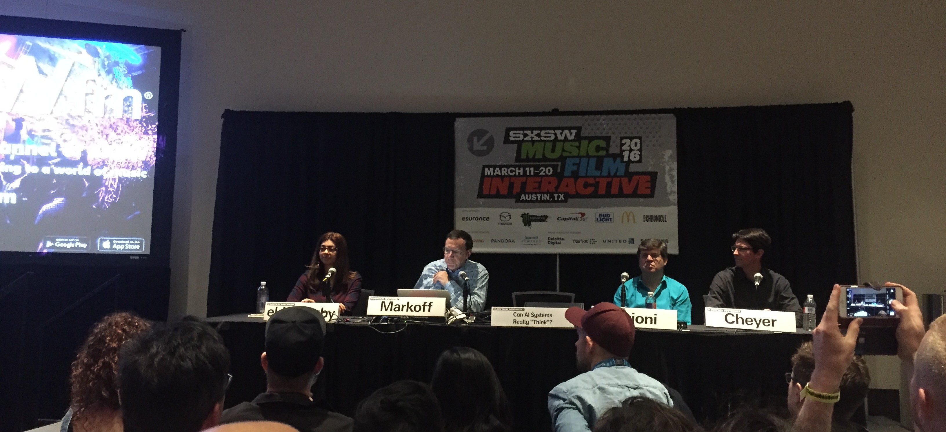
In het panel Adam Cheyer, VP of Technology bij Viv Labs, waar ik al eerder enthousiast over was, Rana el Kaliouby van Affectiva, een bedrijf dat zich specialiseert in emoties en technologie, en Oren Etzioni van het Allen Institute of AI. Mensen uit de loopgraven van de AI wereld dus!
Op de vraag of algemene AI ooit slimmer zal worden dan de mens stak ongeveer 60% van de zaal hun hand op, en 30% dacht van niet. Een goede kickoff van prima discussie over wat er nou wel en niet goed kan met AI.
Wat nu al heel goed werkt zijn systemen die leren met “supervised learning”. Je geeft de software input (foto’s bijvoorbeeld, of geluid van gesproken woord, of 1 miljoen potjes Go) en je vertelt de software wat het goede antwoord was. Door de grote stappen in Neurale Netwerk algoritmes van de afgelopen jaren, plus heel geschikte hardware om grote analyses te doen in de vorm van GPU’s, plus de aanwezigheid van heel veel data om mee te trainen zijn deze systemen nu heel goed in hun taak geworden. Maar dan alleen in die taak. De AlphaGo computer die nu wint van de beste Go speler ter wereld kan niet schaken. En hij zal ook nooit zeggen dat hij vandaag niet zo veel zin heeft. De AI specialisten zien deze overwinning dan ook als een kleine (maar knappe) stap in het veld van AI.
En daar zit een belangrijk punt. AI systemen van nu zijn heel nauw, gespecialiseerd in 1 taak en die beter doen dan een mens. Maar laat zo’n systeem eens een test zien die een kind in groep 4 kan maken, dan heeft de software geen kans. Een tekeningetje van een bal en een plank, met de vraag ‘wat gebeurt er als de bal wordt losgelaten’ is voor een kind makkelijk, voor een AI voorlopig onmogelijk. Daarmee is een schooltest voor een 4-jarige voor een AI systeem veel moeilijker dan een potje Go.
Waar AI ook nog moet groeien is in perspectief. Een debat houden met een AI systeem zal niet zo snel lukken, omdat die zich niet kan verplaatsen in het standpunt van de ander, en daar op in kan gaan. Ook zijn er in de taal nog uitdagingen genoeg, met zinnen waarbij wij uit de context halen welke variant wordt bedoeld.
En die Turing test dan? De Turing test is vooral een test voor menselijke goedgelovigheid. Als je werkelijk onzeker bent of een systeem een mens of een computer is, heb je niet genoeg je best gedaan om de computer te ontmaskeren. Maar gek genoeg vinden mensen dit ook niet altijd erg. Anders dan van te voren was voorspeld wordt er heel veel gewoon gekletst tegen Siri. De bouwers dachten dat de nadruk vooral op productiviteit zou liggen, maar het gebruik was dus anders. Daarom is Siri een beetje aangepast, en geeft het soms kleine verrassingen in het antwoord waardoor het meer menselijk klinkt.
En als die AI er dan is, hoe kan je dan vertrouwen dat ‘jouw AI’ ook werkelijk in jouw belang handelt? Dat vereist vertrouwen. Bij Viv Labs bouwen ze dat op door heel transparant te zijn in wat Viv leert over je. “Viv wants to know this, is that ok and do you want me to remember it?” En je kan later altijd bekijken wat Viv over je weet, en je kan het wijzigen. Er moeten ook richtlijnen komen voor hoe een AI systeem interacteert met de mens, net zoals Apple de ‘human interface guidelines’ heeft opgesteld. Dit is een nieuw gebied en er is nog veel te leren.
En lopen onze banen gevaar? Jazeker, dat is nu al bezig en zal in de toekomst groter worden. Banen die echt risico lopen zijn bijvoorbeeld vrachtwagenchauffeur, maar ook accountants en analisten, zoals eerder al beschreven. Kevin Kelly vertelde er later op de dag over: De banen die gevaar lopen zijn die waarbij productiviteit centraal staat. Daar kan uiteindelijk het werk worden vervangen door een AI systeem. En er ontstaan nieuwe banen; Kelly zegt dat een toekomstige vereiste kan zijn ‘kan overweg met AI systemen’.
Voorlopig is het dus nog niet ‘mens tegen machine’ maar is het ‘mens, geholpen door machine’. Maar iedereen in het panel is er van overtuigd dat het op een dag wel mogelijk gaat worden dat een algemeen AI systeem beter zal zijn dan de mens in de meeste taken. Het zal alleen veel langer duren dan de buitenwereld nu denkt.
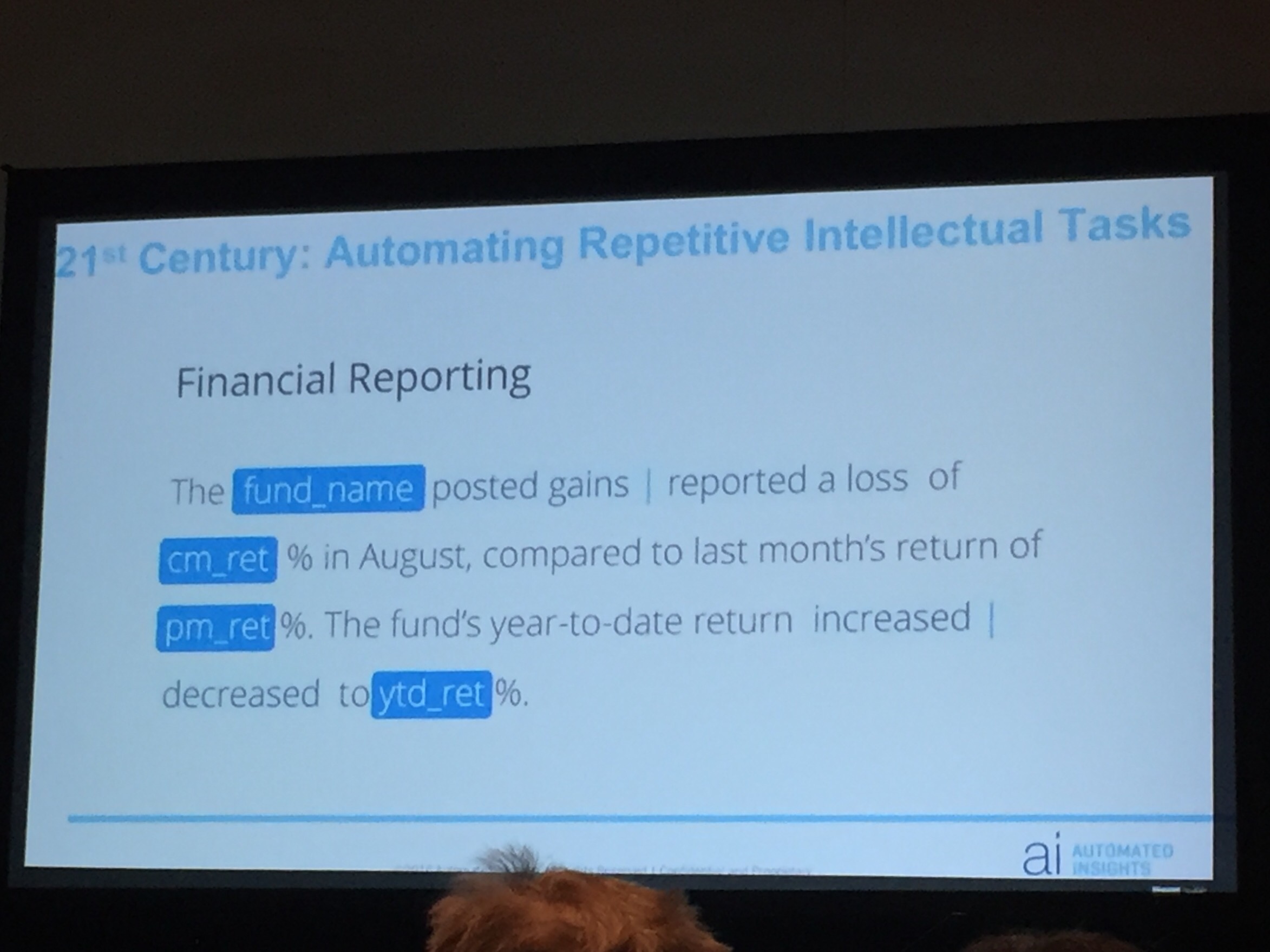
Door robotisering en kunstmatige intelligentie gaat werk veranderen. In het panel Robbie Allen, CEO van “Automated Insights”, een bedrijf dat uit data leesbare verhaaltjes produceert, en Dennis Mortensen van x.ai, een bedrijf dat een soort virtuele persoonlijke assistente ontwikkelt, die voor jou je meetings kan plannen door via email te spreken met de andere partijen van de meetings. Beide zeggen dat ze geen bestaande banen vervangen; de geautomatiseerde artikelen werden tot nu toe niet gemaakt, en de x.ai assistente is voor alle gebruikers niet een vervanging van een bestaande secretaresse. Toch zijn ze er niet zeker van dat er nooit banen verloren zullen gaan.
Kijkend in het verleden zie je dat het werk wat vooral verloren is gegaan, mechanisch herhalend werk is. Een auto in elkaar zetten. Bomen rooien. Landbouw. En in de toekomst loopt misschien ook de vrachtwagenchauffeur gevaar om vervangen te worden. Maar in de (nabije) toekomst zijn ook de banen met intellectueel herhalend werk niet meer zeker. Denk aan accountants. Of analyse in de medische wereld. Of productie van artikelen uit informatie, in de sport- of financiële wereld bijvoorbeeld.
Maar wat moet je dan nu leren, om in de toekomst een baan te houden? De ondernemers zeggen: ondernemerschap is zeer toekomstbestendig. Mortensen vertelt dat hij z’n dochters vooral aanraadt informatica te gaan studeren, want in die sector blijft altijd werk om de systemen te bouwen, onderhouden en verbeteren. En beveiligen.
Maar ja; niet iedereen (Mortsensens dochters bijvoorbeeld, tot zijn groot verdriet) wil of kan ondernemer zijn, of informaticus. Wat dat betreft zijn er geen simpele antwoorden.
En ontstaan er dan geen nieuwe banen? Jazeker wel. Bij x.ai werken 20 mensen aan het trainen van de kunstmatige intelligentie software. En werken mensen aan de interactie van de AI met mensen; wat moet de identiteit en toon zijn van de virtuele assistente.
Duidelijk is dat de kracht van software in de toekomst alleen maar groter gaat worden. En op de vraag wat dit betekent voor de mensen die niet in die sector zitten, hebben deze internet ondernemers ook geen pasklaar antwoord. De kans is groot dat hierdoor de ongelijkheid toe gaat nemen: de eigenaren van de ai krijgen een steeds groter stuk van de taart.
Mooi verhaal van Dag Kittlaus. Hij is een van de makers van Siri, de startup die destijds is overgenomen door Apple. Vlak na de uitrol van Siri in iOS heeft Kittlaus Apple verlaten, en heeft nu een aantal van zijn oude mensen weer bij elkaar voor een nieuw initiatief: Viv.
Viv moet een echt artificial intelligence platform worden. Om het te begrijpen wat ze willen is het goed om dit te vergelijken met Siri. Siri biedt een beperkt aantal diensten, namelijk de diensten die de Apple ontwikkelaars hebben aangesloten. Zo kan je vragen wat voor weer het morgen is, of hoe de Lakers hebben gespeeld. Viv wil dit anders gaan doen, door een platform te zijn voor alle diensten die mensen maar willen aansluiten, en intelligentie bouwen die over al die bronnen heen kan werken.
Je kan dan bijvoorbeeld vragen: “Wat voor weer was het tijdens de super bowl”. Viv gaat dan aan de slag met dat verzoek, door eerst uit te vinden wat dat is, een ‘super bowl’, ontdekt dat dat een evenement is op een bepaalde plaats en datum, en vervolgens daar het weer bij zoekt. Maar het kan ook ingewikkelder: “Waar kan ik straks goedkope wijn halen die goed bij lasagne past als ik naar mijn broer rij?”. Viv gaat dan uitzoeken waar je heen rijdt, opzoeken welke wijnen goed zijn bij vlees en kaas, en waar die te krijgen zijn op de route. En je kan Viv zelfs om 2 uur ’s nachts zeggen: “Ik ben dronken”. De dienst begrijpt dan dat je gebruikelijke Lyft of Uber moet worden opgeroepen om je naar huis te brengen.
Het verdienmodel van Viv is dan een commissie op de transactie, “een beetje als de American Express van AI”. Ze zijn zichzelf als aanbieder van een infrastructuur, en denken dat behalve het Wifi- en Bluetoothlogo straks ook het Viv logo (een V met een streepje er boven) op apparaten en in software zal verschijnen, om te laten zien dat deze Viv compatible zijn.
Ook werd er nog gesproken over de vraag ‘Gaan we nu onze baan verliezen’. Kittlaus denkt dat er inderdaad gevaar is voor een heel aantal soorten werk, dingen die makkelijk vervangbaar zijn door robots of software. Maar dat hoeft niet meteen tot grote werkloosheid te leiden: “De agrarische sector geeft nu nog maar werk aan 3% van de bevolking terwijl onze opbrengsten toch veel hoger zijn geworden, en alle boeren niet werkloos over straat lopen”. Hij denkt dat Augmented Reality kan helpen bij het omscholen van de oude ‘blue collar workers’ naar een nieuwe broodwinning. Opleiden en leren gaat veel makkelijker en sneller als technologie met je meekijkt, en je aanwijst wat je moet doen.
Kittlaus is er ook van overtuigd dat machines op termijn beter zullen denken dan mensen. En weet ook niet wat er dan gaat gebeuren, ‘dat is niet te voorspellen’.
Viv is een zeer ambitieus project, maar als je kijkt naar wie er achter zitten en de eerste indrukken die mensen van het prototype krijgen zou het zomaar kunnen slagen. Dit jaar gaan we er nog iets van zien, beloofde Kittlaus. Meer over Viv kan je vinden op Viv.ai